3.23.2006

Welcome

Interpretations of self front

Welcome to our Virtual Gallery
Several months ago I put forward the idea of creating self portraits to a community of glass workers, who learn about and share their knowledge and passions on the Warm Glass Bulletin Board.
http://www.warmglass.com/
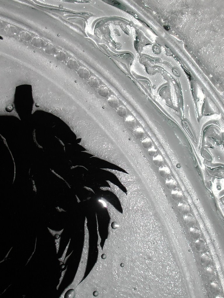
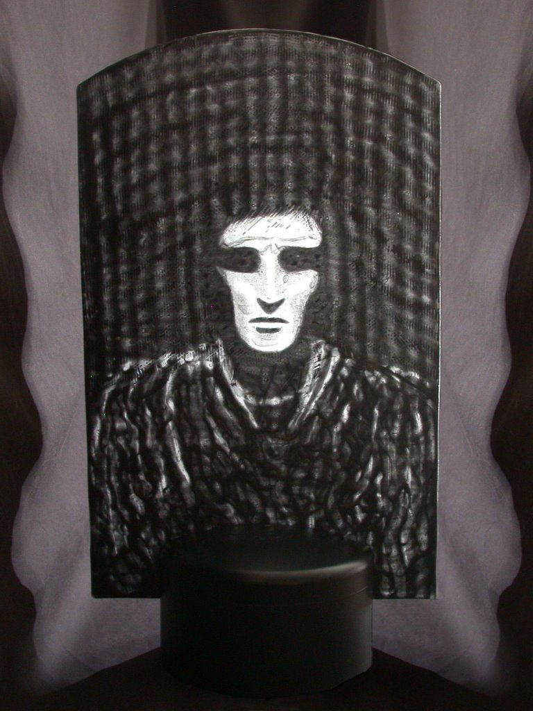
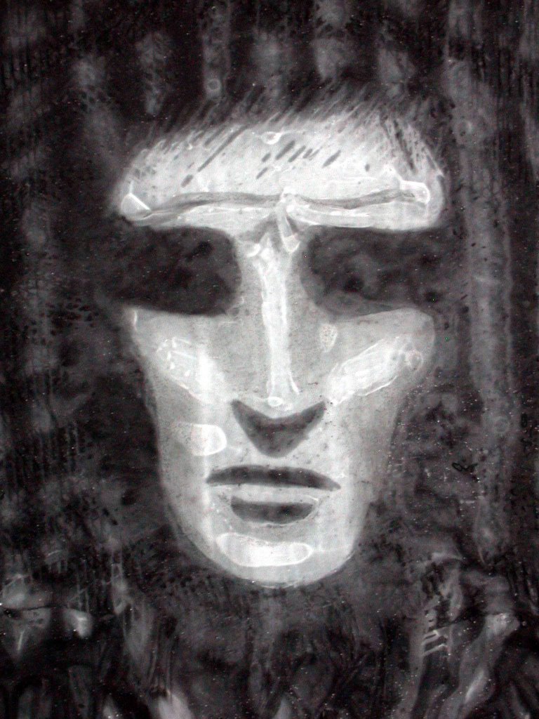
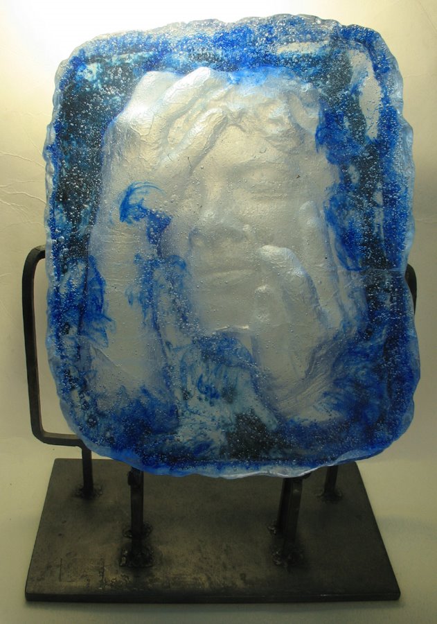
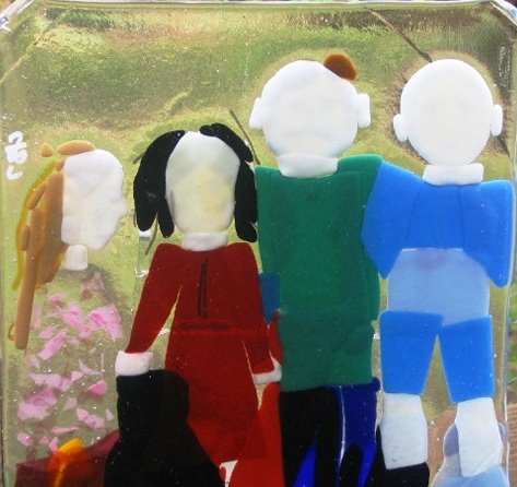
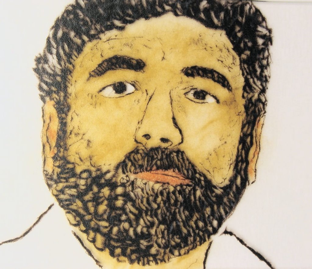
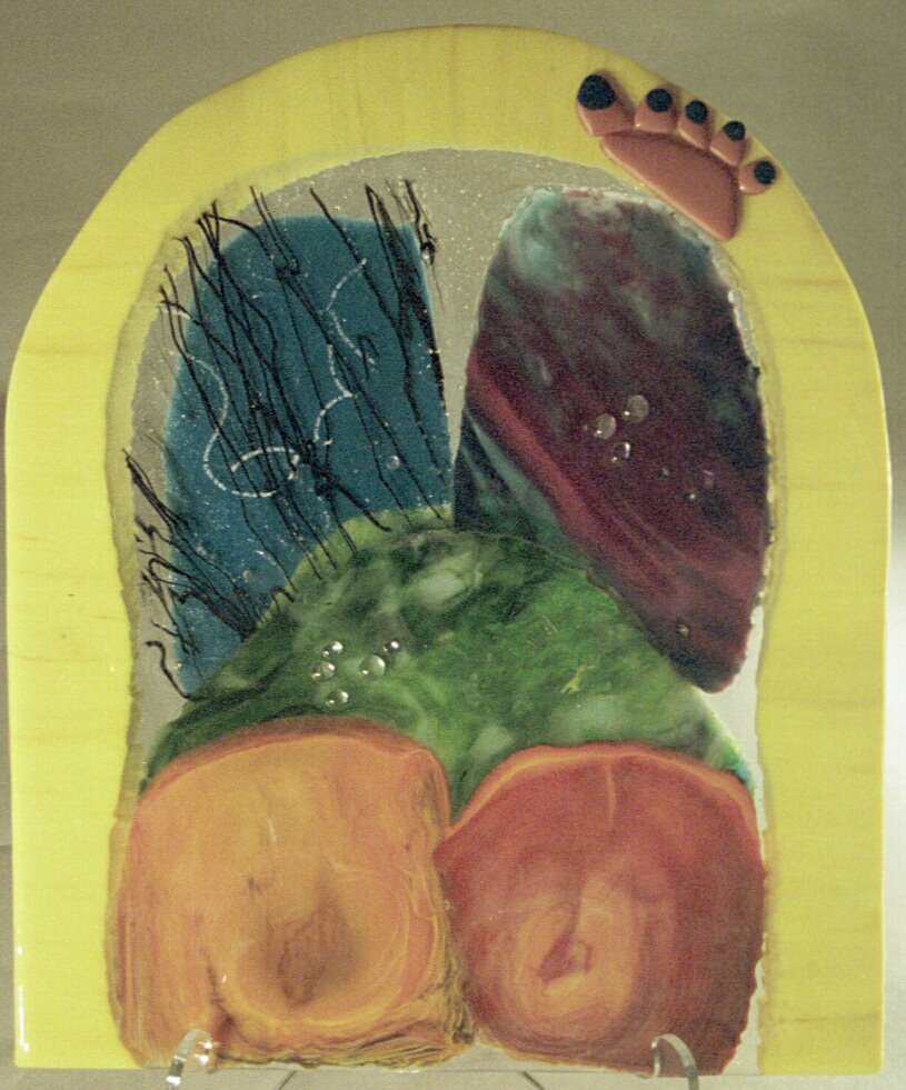
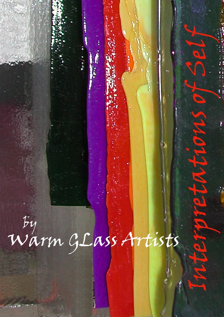
The accomplishments of thirty-nine glass artists who took on this challenge both technically and creatively by exploring this concept, are seen here in this Virtual Gallery.
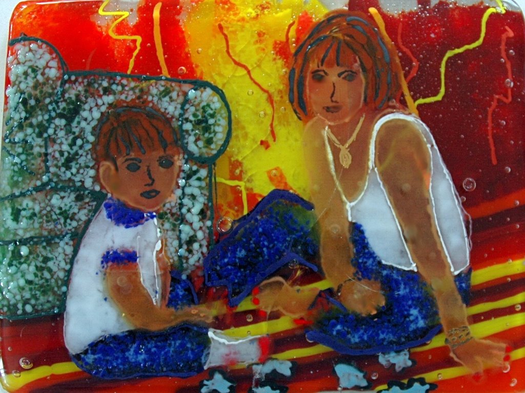
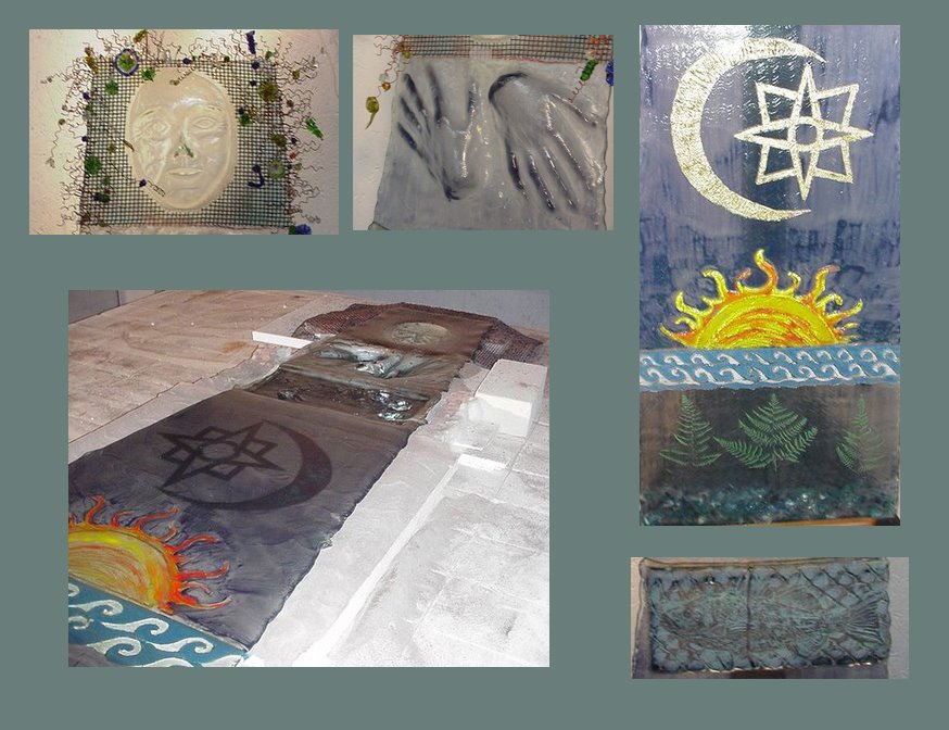
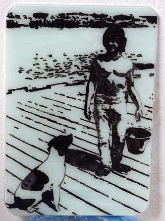
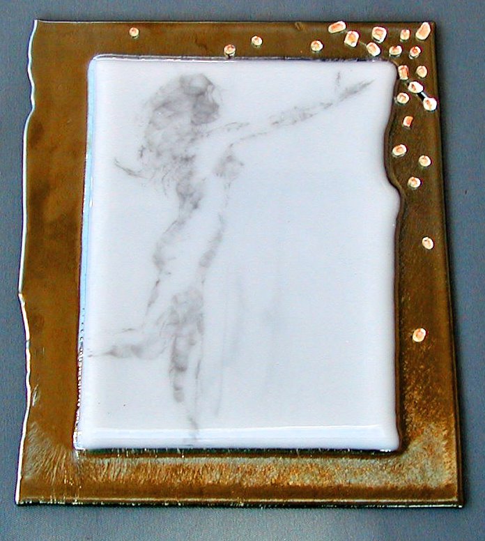
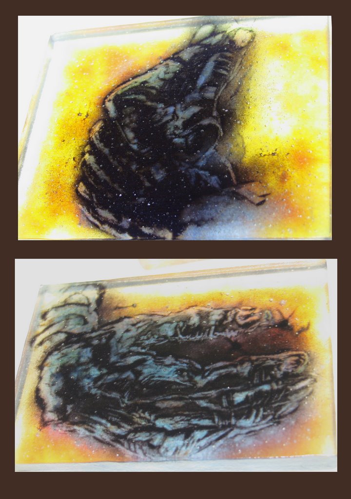
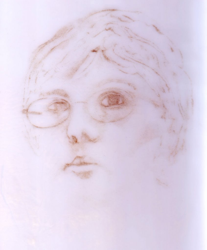
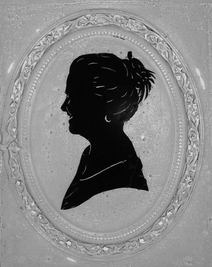
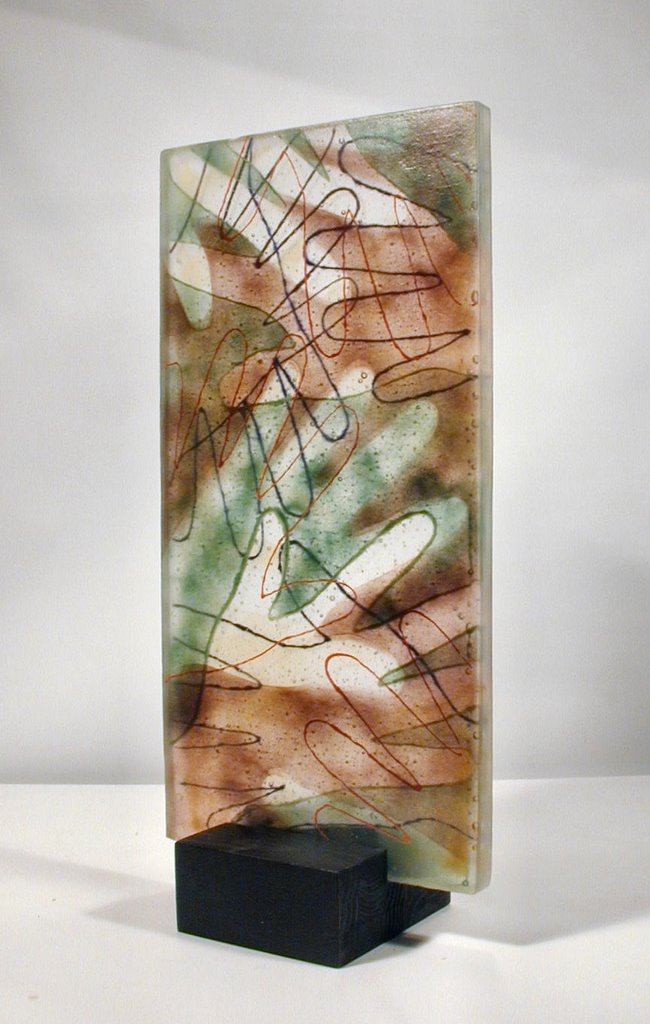
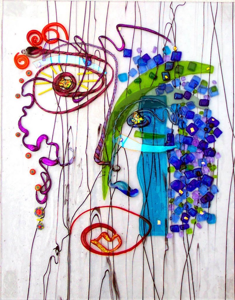
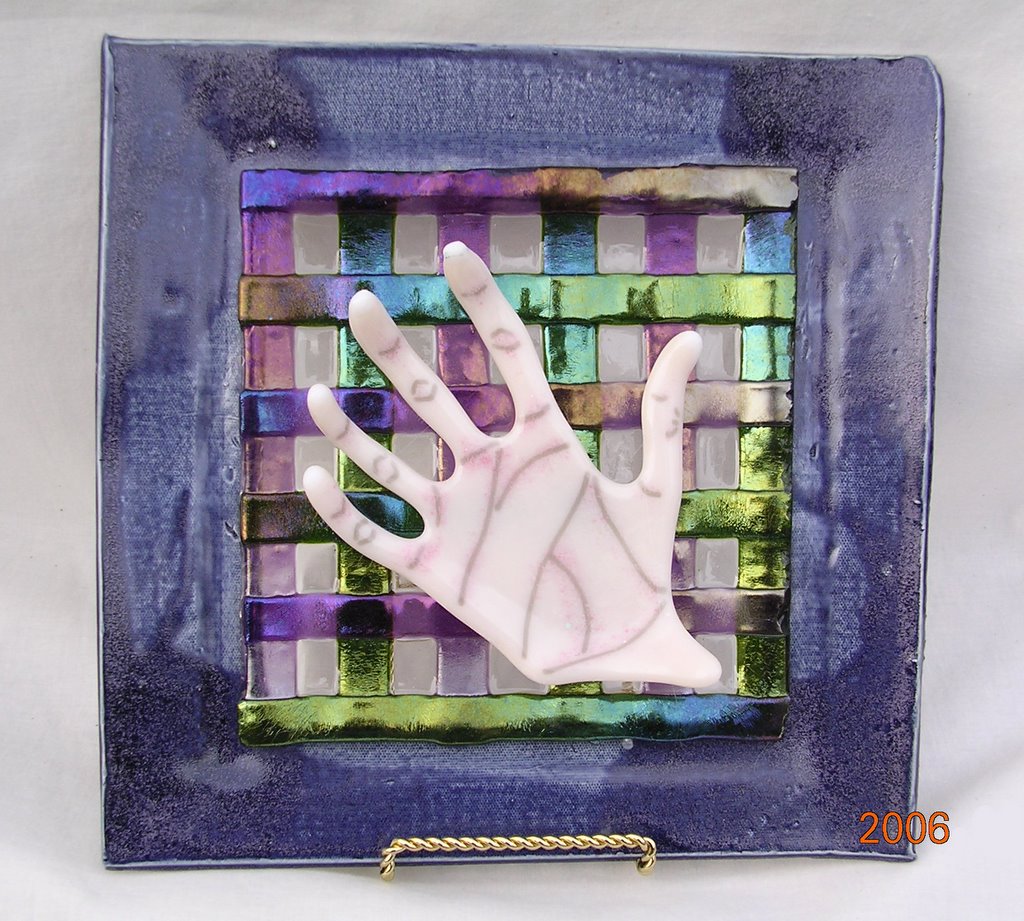
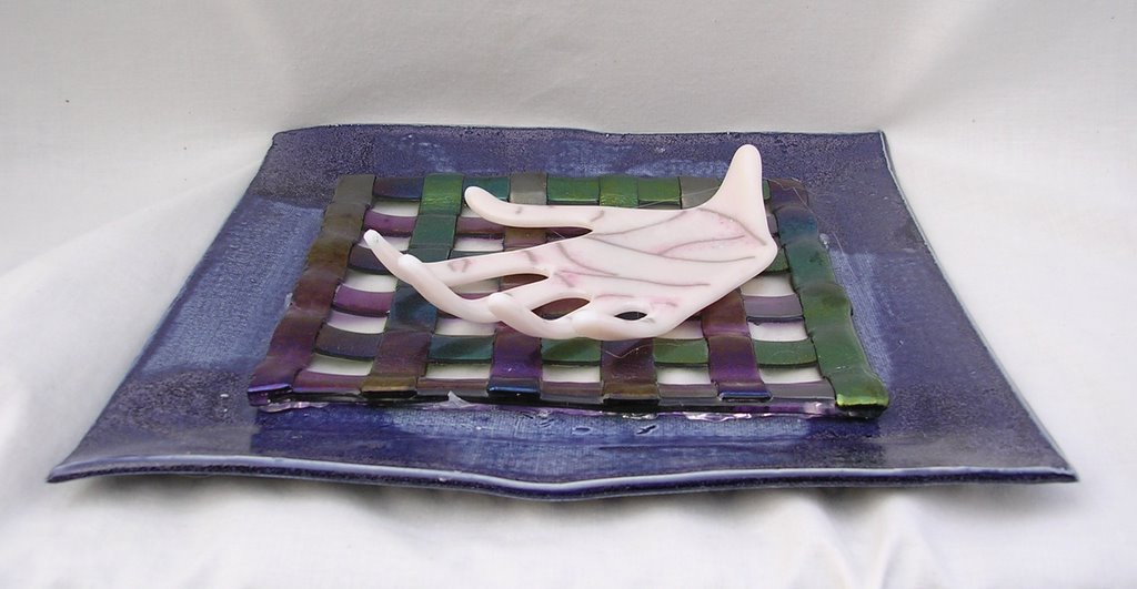
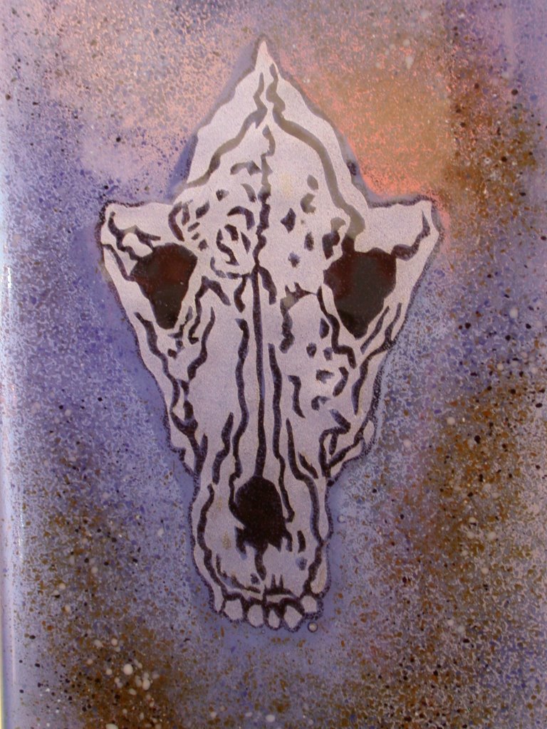
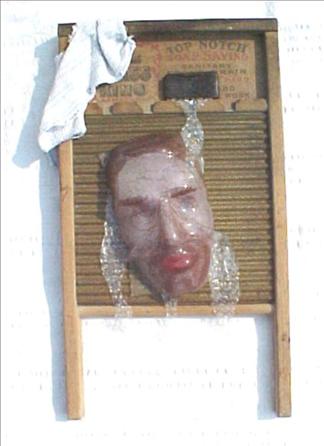
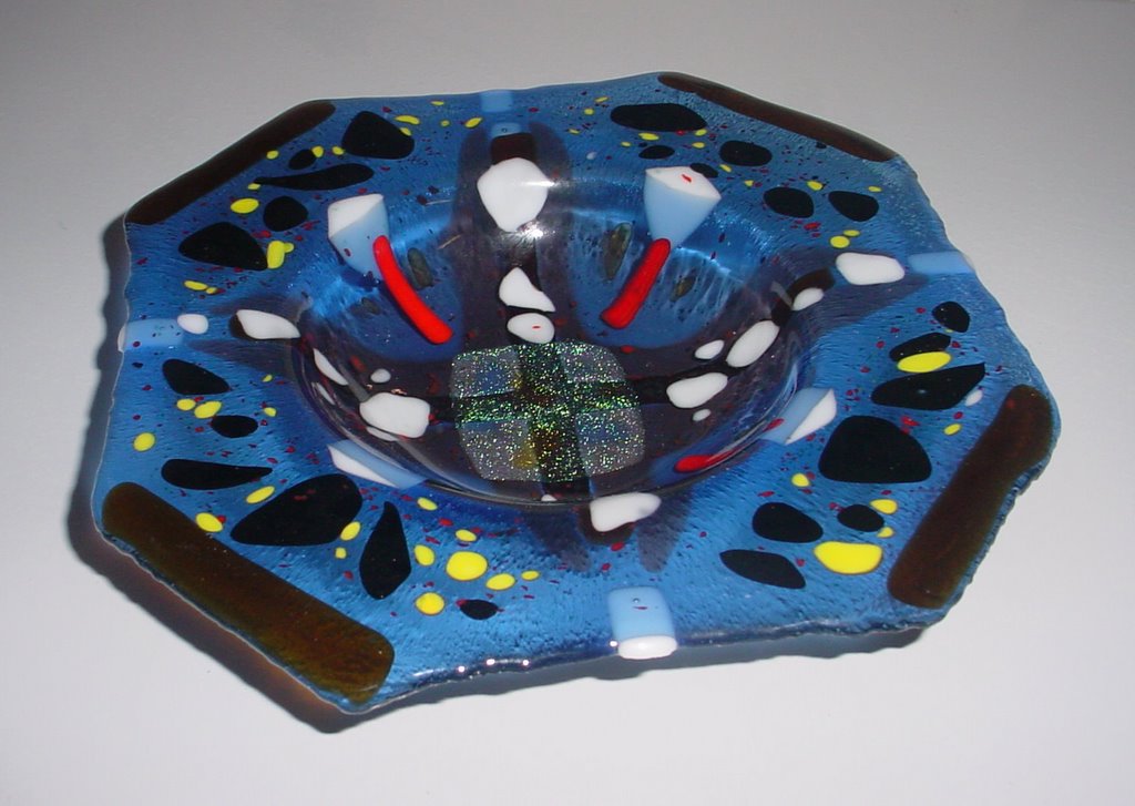
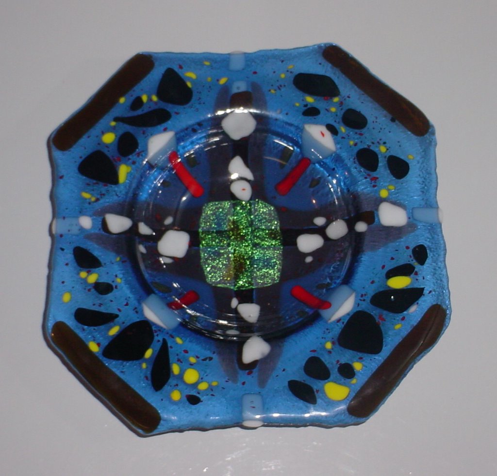
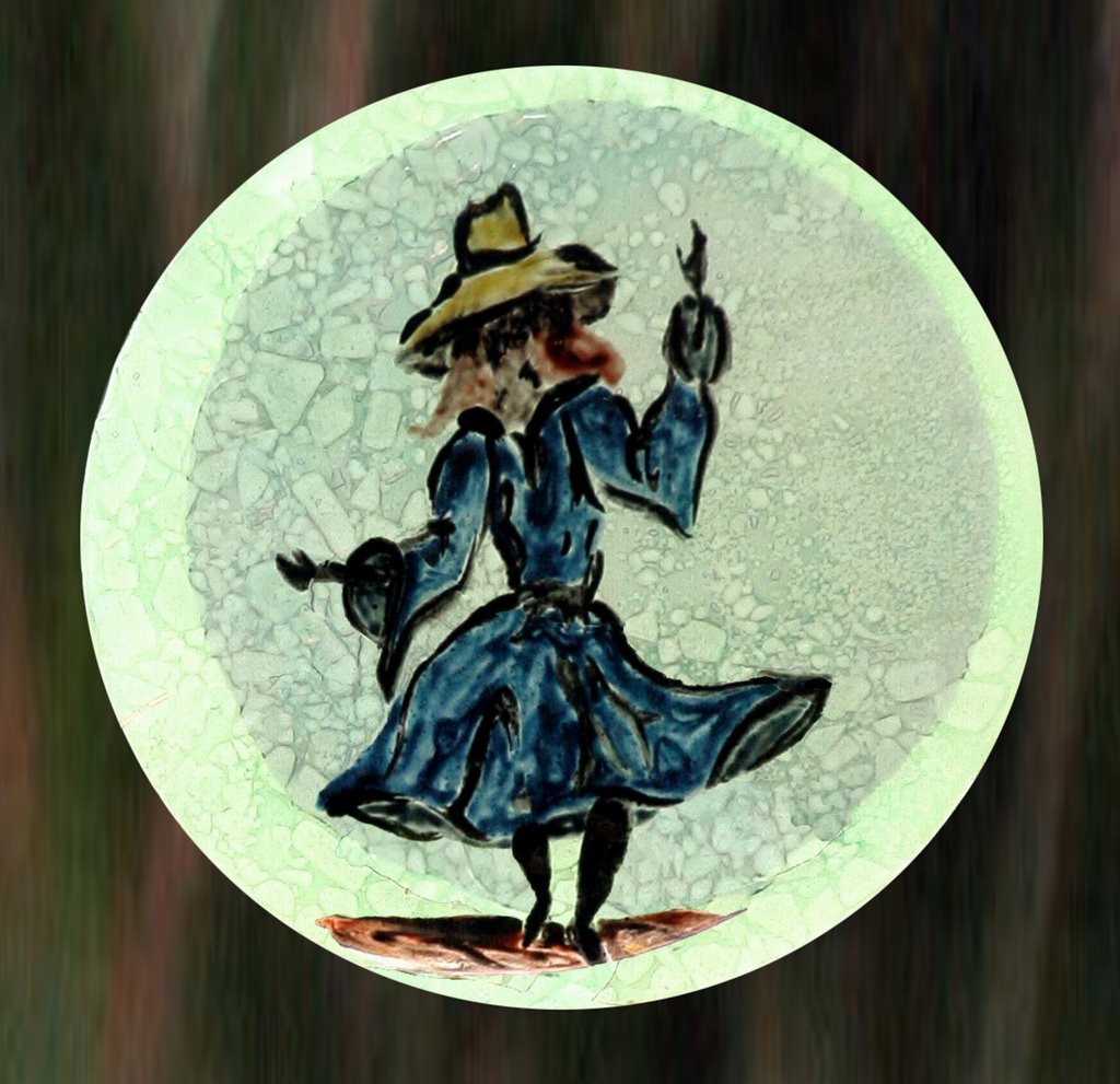
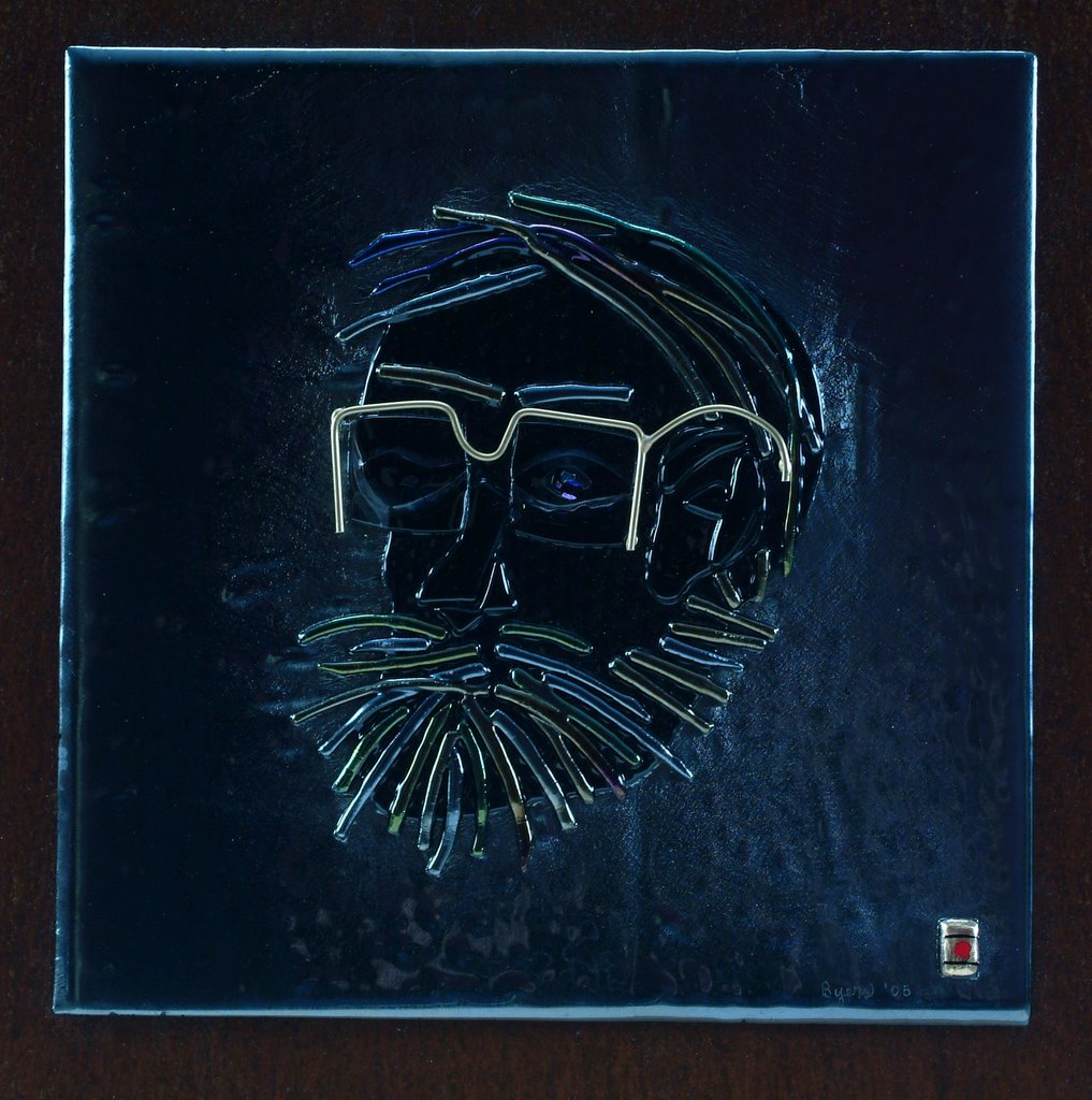
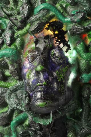
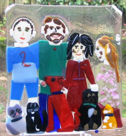
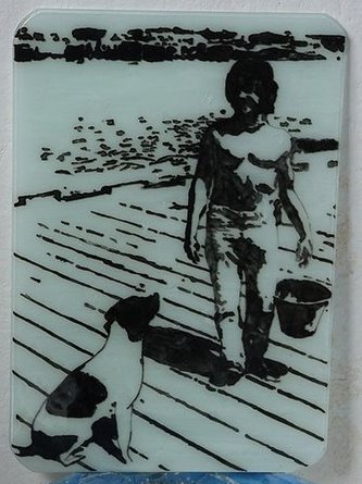
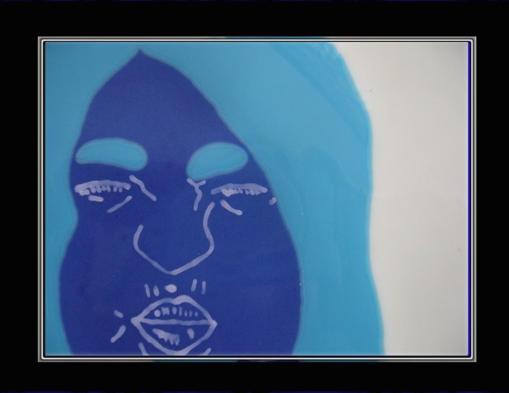
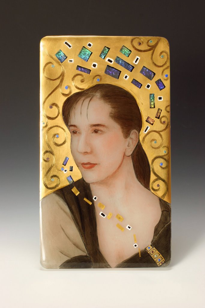
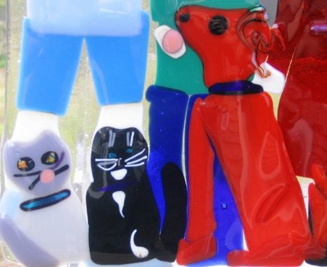
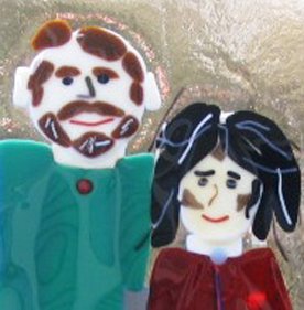
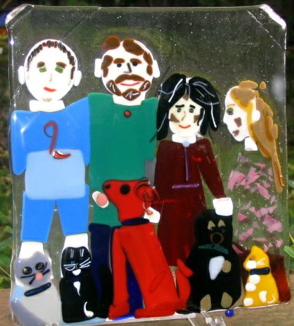
The artists presented have used a variety of kiln forming techniques to create their Interpretations of Self. There is a wide range of artists represented, from professional glass workers to those who do this as an avocation. They are all passionate about glass, kiln-forming and creating, which is evident in the work they've created.

I wanted to thank those who participated in this project, and those who offered advice and support in putting this all together. It was a great deal of fun for me. I learned a lot in the process of making my own portrait and in setting up this site.
Enjoy your visit.

Cynthia Oliver
All works depicted here are protected by copyright and should not be reproduced and/or copied without the express permission of the respective artists.

3.20.2006

Elizabeth Woros

"Power of 2"
8" x 12"


Materials & Process: This is all done in Bullseye Glass. I made a base out of red/orange/yellow strips on the bottom and clear frit with the same colors in powder, frit and stringers on top. I wanted this to be bright and chose these colors with my nephew whose favorite color just happens to be red. The top layer is painted with FuseMaster enamels and frit to create the details. Then I fused the 2 layers together to create a piece about an inch thick. Unfortunately I ended up with some big bubbles and an annealing crack. I also didn't count on the way the colors diluted and some distortion that happened.

Content / Intent Statement: This piece represents the power that comes with interacting with others to accomplish a goal. This particular picture shows my nephew and I putting a puzzle together.

3.19.2006

Rosanna Gusler


"Totem"
life size

Process and Materials: I started by drawing my life sized concept on paper. I left it out in the studio all the time as I figured it out. I worked on that part for a month or so. The face hands and fish were cast in plaster/alumina molds. The hands were life cast and the others I made of plasticine. The moon and Star were made of copper foil that i placed on a sand bed in the kiln. After firing they were gold leafed. The waves were done with fiberpaper and enamel. The ferns are enamel. The sun was stamped into the sand with a styrofoam sun i carved with a dremmel. The peace signs were stamped into the sand with a little wood stamp that i carved with a dremmel. Anyhow, the whole assemblege was stacked together with fiber board and bricks and fiber and sand. Three-eighths inch float glass was put on it, tin side down. I then painted the sun and other colors on the back side of the piece using Ferro enamels. It was fired to 1530f with a 40 min hold. Joe made me the wonderful stand from wood. The beads in the hair are all float and bottle glass worked in a hot head torch. It was fun.

Content / Intent Statement: This self portrait holds and uses symbols that are important to me. From the bottom to the top: Peace signs: we waste resources on war. Ferns: love for the earth and growing things. Waves: love and total respect for the ocean in all her moods. Sunrise: most of the best days of my life have started by seeing a sunrise over the ocean. Moon and star: pictograph symbols for the moon and venus. The symbol for Ishtar, the goddess of female satisfaction. My hands: warts, wrinkles and all, they have seen and done a lot. My face: keeps my brain from falling out. Hair: was a way to use more metal in the piece. I really love glass and metal.


Details

To view a series of process images, go to: http://tinyurl.com/hmm25

Joe Moakley


"Back When it Was Still All Black & White"

Materials and Process: The photo was made black & white by Cynthia Oliver. I enlarged it and used it to trace the image onto the glass. I used a mixture of ferro enamel, ferro low flux, cmc gum, glycerine and alcolhol. The black was done on the tin side of some float using an air pen. the white was brushed on the air side of some float. Prefired to 1100f, hold 10 minutes. I stacked the glass with the white in the middle and the black on top. I fired it to 1500f with a 10 minute hold. This was my first glass piece.


Detail

Content / Intent Statement: I used a photograph from a a really great summer in my youth. That was my dog Winston. I am 50 now.

Judy "JJ" Jacobs

"Throwing Caution
to the
Wind"
9" x 11"
Materials & Process: I used powdered Charcoal Gray frit on a Translucent White glass for the figure; then fired it on top of a Bronze Iridescent piece of glass. I used the rolled edges of the sheet glass to give it a softer look.
Detail

Content / Intent Statement: Unfortunately I broke the top right corner off of the piece when I was vacuuming up my work area and ended up adding the small dichroic squares to camoflauge the crack. To me the end result looks like a woman throwing stardust out of her hand, which signified me throwing caution to the wind and gracefully accepting whatever life offers me.

Terrie Corbett


"You Don't Know Me"
8" x 15"

Materials and Process: Paradise Paint with sgrafitto on Bullseye Glass
Content / Intent Statement: The work which I have submitted is a diptych titled,"You don't know me." It reflects my approach to painting and glass. It is abstracted, expressive, and because of the personal imagery, mark making and surface design reflects the "essence of me" more than any representational piece I could do.

Pat Watkins


“If I Had Wings”
7” X 5.75” X 1” & 7” X 4.75” X 1”

Process and Materials: First, I drew the sketch of what I wanted to illustrate. The title; “If I had wings” is an old Peter, Paul and Mary song.
Second, I cut a large set of tiles – 15” X 17” and began sketching with powders. I didn’t care for the lines, once it was finished so I contacted Catharine Newell for advice.
Third, after Cynthia gave us an extension; I redid the sketch on smaller tiles; separating the total. I had in the back of my mind Catharine’s advice – based on one word “impression” and realized once again, I had missed the goal. Not as badly but nevertheless – I confined myself to lines; hoping to see through the tile to the lower tile.
Fourth, I started from scratch again with the same size of tiles. Slowly I tried to brush away the excess powder to form the impression of the hands. I also changed the colors of the hands. On my second attempt (above) the yellow powder did not differentiate from the other powders; so my piece was becoming dark. I felt it was losing the significance of the light. I am still searching. I believe a technique will come with time and I will find my definition. Perhaps some wouldn’t feel this perplexed but I really want to see movement through the light reflecting from the glass depth as I step around the piece. Fifth, I fused the individual tiles together; then mounted them with the help of my husband.


Content / Intent Statement: My hands are me. The position of one hand clenching to my collar while the other hand is outreaching is a definitive look inside me. The title “If I had Wings” is from a song written by Yarrow/Yardley; better known as Peter, Paul and Mary.
I will attach my statement; hopefully no one would find it too presumptuous.
An Artist’s Statement

A journey; plus a road less traveled bring me to glasswork. Now that I have taken a first step, I would like to record moments of time …”plug and play” within life’s matrix.
I believe we exist unremittingly within an internal or ethereal matrix; which sifts combinations of imagination and creativity with function and form. Journaling this matrix is how we communicate.

Being able to journal another’s life cadence or to render a moment of reflection through glass is my dream. I want to be able to see or touch my work and feel the stories of the characters I have unraveled or created.

Presently I am just formulating techniques and crafting glass forms; I want to expand into a fused somewhat dimensional living portrait. In hope that a viewer would walk up to my glass journal – touch the character as if to feel his heartbeat.

Cynthia Morgan

"Self-Portrait"
8" x 10"


Materials & Process: I used a 8x10 sheet of Bullseye thin Light Peach Cream for my “paper,” because it’s nearly translucent, has a pleasing warm tone, and doesn’t overwhelm fine lines and shadows. Then I mixed together Bullseye powders, in Woodland Brown, Salmon, and Black, to come up with a warm, variable dark brown as my “crayon.” I sifted the powder mixture onto the glass, and moved/subtracted the powders to form the image. Periodically I reached a stopping point, where I felt I’d disturb the existing sketch if I added new powder, so I’d fire to a tack-fuse (1325F) before proceeding. This technique tends to fade thin applications to invisibility, so after each firing I’d add more powder to strengthen a line or shadow, and fire again. All told, there are five firings in this piece.

Content / Intent Statement: I tend to overcomplicate everything, so I wanted this piece to be as close to a simple sepia sketch as possible. No frills. No details. No complications. The woman in this picture looks skeptical, as if she’s beginning to wonder if what middle-aged life promises isn’t simply more of the same. What she doesn’t need right now is more complication.

Barbara Muth

“Inside Me”
(WIP 2006)
14" x 14” x ½"


Materials and Process: Technique was simple, so far. I piled up squares of glass and fired them all together. Next step is to add words. I don’t know yet what technique I will use for the words.

Content / Intent Statment: I have been thinking a lot about how colors can represent emotions and experiences. Our vocabulary is full of such allusions. The work I have been doing lately is mostly about feelings related to experiences. Sometimes I throw in a figure drawing, sometimes I don’t.

So, this isn’t a drawing of my face. Surprise! (You would have been more likely to get a drawing of my knee, or my hands, maybe my back.) Rather, this piece is a portrait of my inner life. My intent was to systematically portray how I am interacting with the world through the use of small fields of color. I was surprised, as the project evolved, to see how much light was in the piece. I had expected it to be darker. That sort of gives me some hope, that maybe the dark moods that seem to color my life these days are not as strong or as deep as I had imagined. It was a hard project for me, coming at a time when lots of other things were happening. Introspection was more difficult than I had expected it to be.

I apologize for submitting a work still in progress.

http://bmuthmostlyglass.blogspot.com/

bmuth@barbaramuthglass.com


3.18.2006

Celyn L. Collins

"Expressions Evolving"
There are three pieces, each 7" x 5"
Materials and Process: I used 90 COE "Curious" glass and Glassline Paint. It is Painted and fused.


Detail shots


Katie Chase

"Self-Silhouette"
18" by 14"


Materials & Process: Two layers of Bullseye clear 3mm; Paradise Paints. Technique: Paradise paints applied through a hand-cut stencil of contact-paper. Fired. Suspended over an impression of a fame pressed into sifted plaster. Fired.

Content / Intent Statement: I was overwhelmed early in the process of making this piece, too many ideas. So I paired it down to the bare minimum: plain glass and a black ‘splotch.’ Even with only two elements, it looks just like me, albeit very old-fashioned-looking. In fact, it often startles me when I catch it out of the corner of my eye.
I like that it is made of negative (reverse) components: both the shadow image and the “fame” (since the raised portion is on the back side of the portrait), and that bending or blocking of light does all the work in this piece.
I have to give special thanks to the Glen Echo Art Glass Consortium in Maryland, (http://www.glenechopark.org/classes.htm#glass), members of which taught me the plaster technique and walked me through firing.

Detail
Detail

Dolores Barrett


"My Icon"
5" x 2 3/4"
Process & Materials: The base for the portrait is fused from two different kinds of glass, namely, Bullseye’s translucent white under the figure painting and Sandberg’s rainbow dichroic for the background base. The figure was hand-painted in thin washes over seven low-temp firings with traditional china paints. The background was applied in a solid layer of 24K roman gold, fired, then “windows” were sandblasted in a Klimt-like pattern. Black and white and colored “jewel” enameled accents were applied and fired. The Swirled background motifs were hand-etched with an agate etching tool.
Content / Intent Statement: I’ve based my portrait on several influential factors in my life. First, I incorporated my experience in porcelain portraiture; I literally pulled out my porcelain palette and treated the glass like a porcelain canvas. I based the elaborate background ornamentation on the work of impressionist painter, Gustav Klimt and the holy icons of the Greek Orthodox churches. It was important to me to use the realistic painting techniques I’ve developed over the last few years of my artistic life juxtaposed with the abstract, free style I’ve explored in my glasswork. This work combines all of my worlds I hold so dear.
Detail

3.16.2006

Joseph Edmunds


"Seduction of Misery
(and the Weeping Soul)"

Dimensions: Glass(48.7cm X 30.2cm X .4cm), Base(12.2cm X 18.6cm), Overall(53.8cm X 30.2cm X .4cm)
Process & Materials - Glass: 2 tombstone shaped float glass blanks. Blank 1 painted with white Bengal paint, underfired to C-018, facial features shaded with black and gray underglaze pastels. Body outline on blank 2 brush painted with Bengal black, underfired to C-018, then finger painted with Bengal black. Blanks were stacked and full fused on textured kiln wash to C-012. Base: PVC pipe cap slotted with a die grinder, then sprayed with blackboard paint(3 coats).


Detail of finger painted surface
Content / Intent Statement: Wallowing in feelings of self-pity and desperation. An exercise in futility, isolation, and despair. Being backed into a corner, with the belief that there are no options. The end result being the realization that without hope, all ventures are ultimately doomed to fail. We are not the products of our environment, but rather, how we react to our environment. A snapshot of the human condition in it's darkest hours.

3.10.2006

Linda Reed

" Work in Progress"
16" high x 30" wide x 13" deep


Process and Materials: There are two separate glass pieces, one is a wave type piece with three layers of profile moving from orange to amber to clear; the other was formed over a created mold, to resemble a tornado, a beginning, a tall representation of formation, it also includes an impression of the profile - a fiber blanket outline built into the slump mold. The glass pieces are held in place on a wooden slab with metal spirals, wood blocks and rock props.
Content / Intent Statement: My self portrait contains wood, metal, stone and glass to demonstrate my connection to those elements that resonate with my soul. It is constructed to bring to mind a shrine, 'a sacred place that holds a collection of objects representing a deity'; it may also be interpreted as a landscape, with landform, tree and weather elements; it presents an evolutionary progression from wilder, more tempestuous, less formed, to more defined yet also mellower, softer, worn - as I move from young and brash and fickle and mercurial to well, yes, still some of all of that, but also older, wiser, a little mellower, softer; there are a number of independent words written within the layers of the profile piece that also represent the progression from youth to maturity, from daughter to lover and wife and mother, from maiden to mother to crone, as well as the unmitigatable and contradictory aspects of my self; a quote from Walt Whitman is included in the middle section , "Do I contradict myself? Very well, I contradict myself. I am large, I contain multitudes." The piece that represents the final phase of life includes words exhorting me to age with intent and dignity and grace - a road map and reminder. It is evident from the percentage of glass devoted to the age groupings that I am in the middle age and have been for some time - the segments representing youth and old age are slender slices of the whole compared to the middle [age] section. Incorporated in the middle segment are a tree - roots, protection, shelter, stability, groundedness - with a tire swing representing family and comfort, a bird - representing the 'wings' part of 'roots and wings' - freedom, independence, separation, individualism; and a path leading to a door that represents choices. Content/intent is a path I usually prefer not to interpret for the viewer, however in this case (a photographic representation) of a piece that was specifically made to reflect self and not necessarily be an 'eye of the beholder' piece, where the viewer will not have the opportunity to examine the details, and in which part of the allure of the assignment was to have the internal dialogue as to intent, I feel obligated to share my intent with you in words. I hope you find some resonance with your own process and your own interpretation of self when I share this intent with you.

http://www.osocobre.com/

Kevin Midgley


"Mushed Me #1"
10" x 14"


Materials and Process: Shoved my face into a mold mix and sputtered afterwards. Not a totally pleasant experience, particularly picking it out of breathing passages when one needs to breathe. It was one I wanted to explore for its possibilities and to see what could be made of it. The glass is ordinary float so it didn't flow in the slump as much as an art glass, which might have yielded different results. The failed areas of the mold surprisingly don't hide all of my facial features.

Judi Charlson

"Artist Reinventing Her Life"
13"H x 10"W x 3 1/2"D
Materials and Process: Kiln cast glass.
Weight : 27 pounds
Date: 2006
The images are in negative relief. Two separate molds were made. One of the artist's face and then another of artist's hands sculpting the plaster mold of face.
The lost wax method was used, and Bullseye Crystal clear cullets were melted into mold via flower pot crucible . The blue color was obtained by painting copper powder mixed with Elmer's glue on specific areas.
The surface was polished with diamond angle grinder.

Detail

Content / Intent Statement: My intent was to show that I seem to be constantly reinventing myself.

2.22.2006

Gregorie Rawls


"Tools of the Artist"
8" x 18" x 1/2"


Materials and Process: Painted, stenciled with frit, fused thick

Content / Intent Statement:
As a glass artist, my tools are my hands, so I believe this is my best self portrait!

2.18.2006

Terry Ow-Wing


"Self"
11" x 14"


Materials & Process: Be glass lampworked and hand cut composed on a background of black stringer on clear irridized.


Detail Shot with flash

Content / Intent Statement: Portrait of "traits". One side of me is very logical, linear, architectural, the other side is silly whimsical and suprising. The older more mature side is the logical side, the whimisical side is still in it's youth - just like my kids - still growing.

2.16.2006

Teresa Barnes


"Three Phases of Teresa"
10” x 10”


Materials & Process: I used all Bullseye glass, iridescent light green aventurine green and iridescent purple striker to make the woven section of the portrait. The hand is made of peach cream with grey stringers and salmon frit to add details of the palm. White opal tips the fingers, for nails. The border is made from stoneware clay with an eggplant glaze.
The palm was made first, fused, and then slumped in a bowl to get the fingers to curl. Then the woven section was tack fused to a sheet of clear glass. The clay border was slab rolled and molded as a platter, fired and glazed, then fired again. Now came the fun part,
firing the glass and clay at the same time. Fiber blanket and thinfire were used to keep the fingers curved up.

Side detail

Content / Intent Statement: I started my artist’s career as a basket weaver. Thus the green and purple woven section. These happen to be my favorite colors. After basket weaving, I turned to pottery, which comes in handy when a specialized mold is needed for my glass projects. I am constantly looking for a way to combine clay and glass in projects. I now work with glass most of the time. I use a lot of iridescent glass which I think is a hold over from my pottery days, when I mostly did Raku firings, which on a good day, had a bright shiny metallic finish. The palm represents my most valuable and constant tool, my hands. They have endured the most abuse, being in water with the basket weaving, abraded with grog in the clay, and enduring varying degrees of cuts with the glass. They have yet to fail me.

2.13.2006

Kate Saunders


"Under My Skin
(Wolf Skull)"
7"x10"

Process and Materials: The lines of the skull were made with powdered frit sprinkled on glue that I painted onto three fused layers of Bullseye glass. After kiln- firing I used clear contact paper on top of the lines to preserve them (I used a utility knife to cut areas I wanted color on) and sprayed on several colors of mica. After firing the mica I used more frit around the skull and fired once more.

Content / Intent Statement: Starting as a child, I have always had dreams where I am a wolf. I used to say that I was a reincarnated wolf, but that's a bit too new agey for me now. I do know that the wolf lives in my heart.
My husband and I go to Yellowstone once or twice every year to watch wolves with the restoration project.
Having eye contact with a wolf in the wild changed me, and this piece is about that moment, of the stripping away of boundaries, about the potential wilderness in us all.

Shorty

"Washing My Face"
17" x 24"


Side Detail


Materials and Process: Glass, wood, metal, marble, paint, cloth, wax, plastic, and soap. Description; Slumped glass xerography face, reverse air brushed and mounted over white marble, on an old brass wash board.

2.06.2006

Marty Pitcairn

"Marty Distilled"
15" x 8"

Detail
Materials & Process: Bullseye glass with a few bits of dichroic for the pupils and earrings. The blank is patterned iridized to add texture to the piece. Complex cuts were made using a ring saw. The earrings were shaped with a torch before fusing. Liberal use of expletives.


Content/Intent Statement: I am the sorcerer's apprentice in my husband Stan Harmon's glass studio. He signed me up for this project. I've had fun fusing tropical fish species designed with chunky outlines and adding frit or stringer for detail. I decided to try working with my own image in the same way, reducing the whole to the simplest lines. Boy, was it tempting to ignore the forehead and smile lines. But I didn't. And since I like to be useful, I slumped the whole business into a platter. What the heck!

2.02.2006

Jennifer Henrod

"Controlled Chaos"
9" x 9" x 2"


Detail


Process & Materials: I used Spectrum 96 glass. I began with a sheet of blue, added "orange cross hairs" in the center and built out from there with frit to accentuate it. I tacked it all together with Elmers Glue and took it to a full fuse at about 1350. I slumped it through a circular drop ring on 2" posts. It is a triumph as it is my first piece to run start to finish without error. Yippee! I have learned so much since I plugged in my kiln for the first time 5 months ago.

Content / Intent Statement: I took a brain test once and found I am neither right nor left brained, but a balance of both. This piece reflects that I think. I started with a basic symmetrical plan in blue, amber, and a smoke. Then I added large chunks to get the "animal print" looking patterns that represent my near "primal" need to do art. There is a single piece of bold pink dichroic at the center, like me, almost "out of place" in its surroundings. To finish, I accented with colored frits because everything in my world is bathed in color.

Susan Bradshaw


"Blue Moon Dancer"
11 inches diameter

Materials & Process: Bottom layer BE 0112-50 mint green. This was topped with hammered 1101, 1101-03, and 1101-02, and dusted with 0144-08 teal green. Middle layer, 9 1/2 inch circle of BE 1442-50 neo-lavender. This was topped with hammered 1101, 1101-03, and dusted with 1116-08 turquoise blue. Top layer BE 1101-50. Painting used Sunshine Enamels, black, chestnut, mandarin, and turquoise, mixed with CMC and diluted with alcohol. They were brushed on. Some of the color variation is the thickness of the enamel, some is how the enamels were mixed together. It was fused in a kiln.

Content / Intent Statement: I signed up for this to stretch myself and my glass work. I very rarely do human figures, and wanted to do something relatively realistic. I dance in public only by the light of the blue moon, but when I am working with glass, listening to my favorite music I dance in my studio. I like wearing hats and swirly dresses. I like painting with water colors. This is my first painting with glass enamels, and I can tell I am going to like painting with them.

1.29.2006

Ron Coleman

"Self Portrait"
9" x 11" x 4"


Materials and Process: Bullseye, 1401 crystal clear cullet cast in a plaster/silica mold.The original art work was carved in ceramic clay and a silicone rubber mold was made from it. The rubber mold was used to make a plaster/silica mold for casting. The back and edges of the finished piece are coldworked and it is mounted on a piece of granite.

Content / Intent Statement: I was really pleased with the results of this piece, since I've never attempted to do any life forms before.

1.26.2006

Jan Barker

"Layers"
6" x 6" x 1/2"
Photgraphy by Chris Bailey

Materials and Process: Bullseye glass and snipped rods, Glassline enamels.

Content / Intent Statement: Thoughts: I just started back into fusing 6 months ago after a 10 year hiatus and I wanted to try new things. I decided to make a thick block. I was pleased that it survived the fusing - and now I know I need to polish my cold-working skills as well. The piece itself represents the layers of my life and the creatures who reside there.

Thanks for the opportunity to explore and play - I still have a lot of learning to do and skills to acquire but I remembered right away why I have always been drawn to glass.

1.22.2006

Mike Byers

"Self-Portrait ~ Reflections in a Dichroic Eye"
24" x 24"


Materials and Process: Medium: fused glass and bronze on steel plate.
Notes: I used Bullseye, CBS dichro, Uroboros, GNA and DTI/Wasser for this piece; all 90COE glass. It was done at a fairly low temperature; about 20 minutes at 1350 in my Paragon GL22. The carbon steel plate was treated with hydrochloric acid, given several coats of Penetrol and finished with paste wax and steel wool. Liquid Nails adhesive for granite and marble was used to attach the glass to the steel plate; the center of the plate where the glass is mounted was not finished with acid, Penetrol or wax. The piece hangswith a French cleat that is attached to the steel with countersunk screws.

Content / Intent Statement: This is more-or-less a cartoon in glass; I used all the typical things I tend to use in my fused glass pieces: black glass, irids, bronze rod and a touch of dichro.

www.ravenglass.org

Laurie Young

"Medusa"


50 x 60 cm
22" x 23"
The Medusa was out of a series I did for my Honours degree exploring mythology and women, I also had a Lilith and Stheno and Euryale, using my own and good friends faces for models.
I made three Medusas, two in Pate de Verre, using Bullseye glass, and one in Blackwood crystal. They are quite massive, the pate de verre ones being around 50X60 cm, and the crystal one weighing over 50 kilos.


Medusa Represents: "Sovereign female wisdom. The female mysteries. All the forces of the primordial Great Goddess: The Cycles of Time as past, present and future. The Cycles of Nature as life, death and rebirth. She is universal Creativity and Destruction in eternal Transformation. She is the Guardian of the Thresholds and the Mediatrix between the Realms of heaven, earth and the underworld. She is Mistress of the Beasts. Latent and Active energy.
Connection to the earth. The union of heaven and earth. She destroys in order to recreate balance. She purifies.
She is the ultimate truth of reality, the wholeness beyond duality. She rips away our mortal illusions. Forbidden yet liberating wisdom. The untamable forces of nature. As a young and beautiful woman she is fertility and life. As crone she consumes by devouring all on the earth plane. Through death we must return to the source, the abyss of transformation, the timeless realm. We must yield to her and her terms of mortality. She reflects a culture in harmony with nature. " from Tufts University


Detail

http://www.matengo.net/

matengo@netspace.net.au

Enid Traisman

"This Tribe of Mine"
9" x 9"


Detail of back


Materials & Process: 9 inch square Bullseye Tekta base. A variety of colors and types of bullseye glass including frit and stringer cut, nipped, arranged and layered to create design. Fired once, a full fuse at 1465 for 10 minutes.

Content / Intent: It was interesting and telling for me to discover that my self-portrait is not just me, by myself. At this point in my life I see myself as part of my family unit which includes a hubby, two teenage children, two big dogs and 3 cats. Within the chaos of any given moment I find joy and refuge in my little studio in my basement.
I like how I seemed to capture a “moment in time”. My hair looks wild and crazy, the kids are ready to take off and the pets anchor me. Hmmmm, I wonder what my self-portrait will look like a couple years from now….

Learning Curve: This was the 3rd piece I ever made. I learned a lot…
Don’t put the glass right up to the edges of the kiln shelf, it will melt over.
Be sure to take the white writing off the glass BEFORE firing or it becomes permanent.
Little pieces of glass may jump around and shift during firing…i.e. hair.
Confetti glass with pink is not a good choice for daughter’s dress, she is see-through!
Cranberry confetti turns brown on vanilla, not a good choice for rosy cheeks.
Mostly, remember to enjoy the whimsical quality of creating with this medium.

Tony Smith

"Self Portrait"
9" x 12"


Materials and Process: The base of the piece was 1/4" System 96 clear. A total of 6 firings and 5 different powders were used to create the piece. A full size photograph was used for reference. The first firing was black powder dragged into outlines using a rubber tipped wipeout tool. The second firing was on the same side and filled in some of the solid areas with more black powder. White powder accents to the hair were added for the next firing . The next firing was an attempt to add some color to the skin using sifted light amber powder on the backside of the piece. The piece was sandblasted to trim the amber and lip color was added prior to the next firing. The lip color turned out to be too red, and was sandblasted off. A mixture of red and pale purple powders was applied for the lips and some red accents were added to the ears prior to the final firing.

Content / Intent Statement: What I like about the piece is that I think it looks like me. What I don't like about the piece is that it looks like me. My asymmetrical nose and lip make the piece look wrong, so I was tempted to adjust it to make it "correct" as opposed to accurate. I opted for accuracy. I wondered what van Gogh thought about doing a self-portrait and if he would have used the side with his "good" ear.

I think the amber was too dark and would have chosen the paler straw if I tried it again. Also, the shading needs work. I rarely use powders, but if I were to try it again in the future, I would need much more practice.

All-in-all, I think the project was worthwhile. It gave me an appreciation for working with multiple firings to tweak and tune the piece.

Cheryl L. Sattler

"Bathtub Daydream"
13" x 19"


Materials and Process: As in all my work, I make a variety of components and assemble the final piece in stages. For this work, I created the breasts with pot melts, the belly with a wire drop, the pink thigh with a separate wire drop, and the blue thigh with a composition of crushed irridized glass and streamer glass with white-out, tattoo-like embellishments. The components are surrounded with crystal clear frit and a strip-cut yellow border. The piece was dammed and then cleaned up on a wet belt sander, then re-fused to add the bubbles and foot on the surface. The toenail polish is Paradise Paint.

Content / Intent Statement: I spend a long time thinking about how "I" see myself. Quite literally, I realized that I only see my body, never my face (unless in a mirror, and that's technically backwards). At the same time, a faceless woman is "every woman" - and as a feminist, I strongly believe that what happens to one of us, happens to all of us. The setting is pure whimsy: I spend alot of time in the tub dreaming - at the end of a long day I lose myself in bubbles and thought. (That's also when I see myself naked.) In a dream, why bother to be realistic with color or proportion? So I foreshortened my torso- sometimes I feel that I'm all belly and breast and thigh - and propped onefoot on the edge of the "tub." I almost put a rubber duckie in the assemblage, but decided that might be a bit much.